 An inviting homepage is an asset to your website. All your email subscriptions, newsletters, social media traffic from advertisements are all usually directed here. However, to increase conversion rates, a landing page is becoming increasingly efficient and essential.
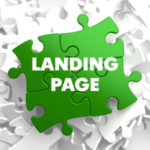
Landing page is a page that captures user information. It is a form that a user fills up when he/she lands on your website. A good landing page is important for the success of your online marketing campaign. Moreover, it also directs the customer what to do next.
Landing pages create first impressions which usually influence the customer in further pursuing the product/service. To ensure that the landing page leads to good conversion, here are a few do’s and don’ts of creating effective landing pages:
Do’s
- Use catchy headlines and smart content
Make sure you keep headlines concise and attractive. Your landing page should give precise information and pique interest in the product/service. Use bullet points, appealing fonts and smart phrases. Be clear and to-the-point.
- Be consistent
Ensure that the page is symmetrical to the campaign that brought the reader to your page. If your email, ad-posts etc. have a certain format or design, keep it consistent in your landing page as well by using the same designs and color schemes.
- Use graphics and visually attractive content
Include diagrams, info-graphics, pie-charts and pictures. A potential customer will scan through the landing pages quickly without reading in-depth. Try to present as much information as possible pictorially.
- Add a “Thank You” page
After each customer conversion, lead them to a thank you page. This will help you track the conversions. Once converted, customers are usually trusting and willing to share more information. You can ask for feedbacks, ask them to participate in polls or surveys.
- Use trust markers
It’s difficult to know what is authentic online. Be sure to add logos of affiliate services such as Visa or PayPal. A customer will be reassured if they see verification from trusted organizations.
 Don’ts:
- Ask for too much user information
Keep the form fields relevant to your offers. A lot of information fields discourage customers. It is seen that you lose up to 30% of respondents for each information field. Avoid dropouts with clear and minimum information requests.
- Include too many links for other actions
Keep a single goal for your landing page. Else, you could confuse the visitor and decrease chances of conversion. If you wish for them to engage in more activities, try including it after conversion is complete.
- Redirect to your homepage
See if there’s a more relevant page customers could be redirected to, such as listings of products or purchase details etc. instead of simply redirecting them to the homepage of your website.
- Go overboard with AV clips
Customers usually do not have the time to buffer videos and watch the entire clip before deciding to pursue it further. In case you want to include a video, make sure the information is also present in other forms for those who are just scanning through the information.
- Leave customers hanging without a relevant CTA
Always instruct the user on the next call-to-action. Provide ample information about what options they have after having viewed the landing page.
By: Ishan Bhat