Design and content are two strings that hold a website together. For an e-commerce website, design proves to be a game-changer! It constructs catalogues of high utility while providing a hint of glamour. There is an incessant effort to unite every new trend and emerging media in website designs. However, it may be a human error or a failure of logic that creates irreversible errors in a website. They must be understood and avoided to ensure a flourishing business. We have listed down top 10 design mistakes that may be affecting your eCommerce Store.
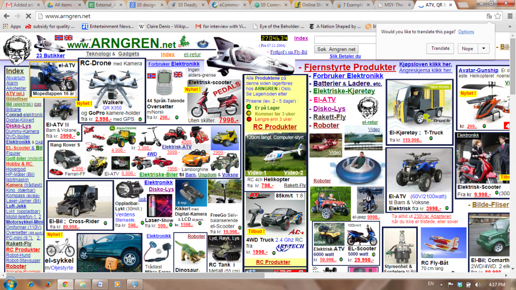
1. Complicated Navigation
The first thing a visitor does after landing on your website is checking it out completely. No doubt you need to flaunt all the exciting stuff, but a solid menu is a long term investment. Starting from placement of tabs to defining them precisely, each little thing matters. A left to right and top to bottom logic will help you position vertical tabs on the left and horizontal ones on the top. The most important task remains to strike a balance between not keeping it too vacant and preventing overcrowding.

2. Misplaced/Ill-sized Icons
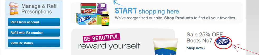
Certain design conventions have their importance and their due must be given to them. A left or center masthead, a center or right search box and banners of the latest offers right at the centre, are certain beneficial ploys. Important logos, like the brands you host, need to stand out in the crowd of colors and their size must be such that they are noticed easily.
3. Inefficient Search Engine
If customers are looking for anything specific, they will definitely use the ‘search’ option. Place it at a visible point and make it as efficient as you can. Also give both options of hitting ‘Enter’ and to click an icon or ‘search’ button, to execute the search. You also need to support the engine with adequate data. It is shabby job if your site replies to something commonplace as ‘no results found’.
4. The Checkout Takes Forever!
It is one thing to ask customers to re-enter passwords while signing-up, but asking to re-enter shopping details is archaic. Trust the customers on accuracy and keep room for corrections if anything goes wrong. The best e-commerce websites will have single button checkout and not pages after pages of verifications. It should become further easy when customers have an account.
5. Mandatory Signing-Up
While having an account makes it easier for the customer, instant shopping is an equally important functionality to have. There is a wide range of customers beyond the shopaholics – the occasional buyers, those in search of specific items and those who simply hate entering all the account details. The best way to convert these patchy shoppers into regular ones is to offer them impeccable service and not mandating accounts.
After clicking on ‘SHOP NOW’
6. Not Having a Mobile Version
The online customer is distributed on number of devices today. So if a shopper needs to see your catalog on the go, and what you offer him is a compressed desktop version of your website, chances are you will lose him/her forever. Smart and savvy mobile versions not only widen your appeal but create an interesting version that makes you dynamic.
Desktop Version:
Similar Mobile Version:
7. Less and/or Low Quality Images
If you are an e-commerce, visual appeal is your first bet to hook customer. As a limitation of the medium, products cannot be touched and felt before buying. Online stores perpetually face the problem of mistrust and hence the elaborate return policies. The surest way to clear the fog is by posting detailed and clear pictures of your goods. This can also be supplemented with catchy advertorials.
8. Missing Social Media Links
It is a cardinal sin to forget social media in today’s age! It is matter to minutes to add these buttons to your design but the benefits you reap are innumerable. The hits and the popularity of your site become visible which acts as a trigger to further hits. You can also get quick and valuable feedback that helps you improve and show off the praises!
9. Not Inserting Call-to-action
Call-to-action is something that tells the visitor what to do next. An e-commerce site has huge amount of stuff and visitors might be baffled about how to explore it. Right from the landing page to the final payment, you need to guide them with definitive options. Call-to-action also makes sure that your design logic reaches the customer in a subtle way.
10. Missing Contact Info
Contact info is one segment that crosses the purpose of being a communication utility. It solidifies the customers’ faith in your brand and assures them that any irregularity will be handled.