Any article you read about what to do with e-commerce will invariably have a “Go Mobile” or “Think Mobile” point in it. Then it could be about site design or an e-mail campaign or anything related to eCommerce. This is what “mobile commerce” or “mCommerce” is all about. Having users engage and buy your products on their mobile devices. Marketing mobile apps are all-important now because the reach is increasing manifold and people are getting more educated and comfortable about making purchases on their handheld devices. This is true across age, gender, geography.
We know we have to catch the user’s attention in the little time they spend on our site. The unique thing about mobile commerce is we have limited space too. And this is exactly where many mobile eCommerce sites make mistakes.
Mobile Commerce Mistakes
Mistake #1: Same content and design as a regular website.
Why is it a mistake?
The audience is different. Not all people who buy on their desktop are going to buy from their mobiles. A mobile commerce site as a tinier, cuter version of the traditional site is a mistake.
You cannot be done with just responsive web themes. They would just squish the entire PC experience. This makes the mobile site cumbersome to navigate. For example, carousels and slideshows are big no-nos. They slow down the load time terribly.
Fix it:
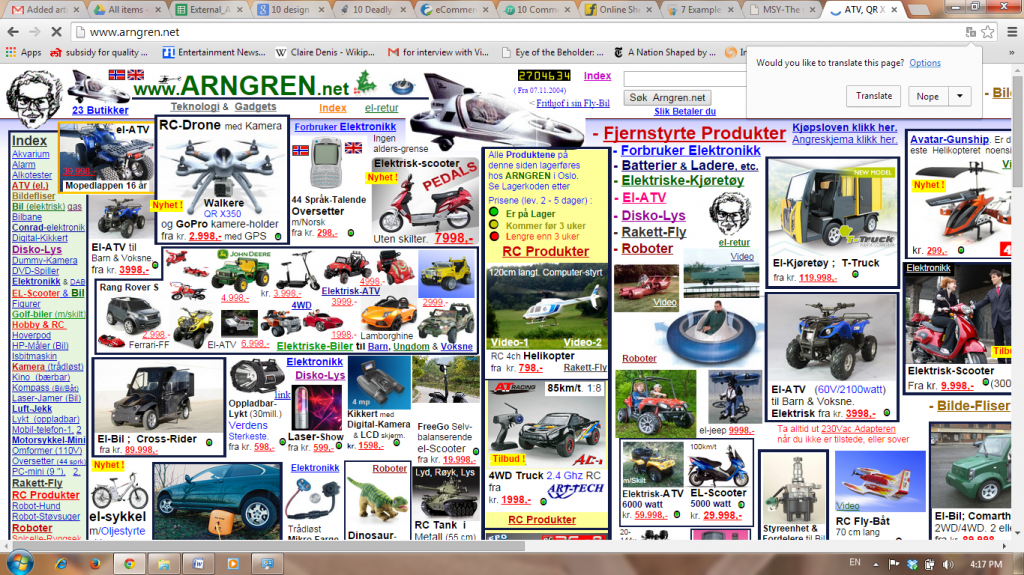
– Simpler design: While even for an online store on PC, a complexity is a web design mistake, with the mobile website you have to make things even simpler.
– Avoid scrolling: Make sure the content doesn’t run into pages and pages.
– Direct action: While you don’t want your mobile website to be directed to only one goal, the landing page’s primary aim should be to take you directly to where the action is. For instance, a mobile user doesn’t necessarily have to be able to reach to each of your internal pages from the landing page.
– Go vast: While you are at it go for as many devices as is possible, keeping varying network speeds, resolution, future mobile models and OS versions in mind.
It is an expensive affair but the rewards you earn in terms of more conversions will be well worth the costs.
Mistake #2: Developing an App
Why is it a mistake?
– Do you need it?: Technology is changing every single day. Do you have to follow every mobile marketing trend? The first question to ask is – is a dedicated app in-sync with your overall objectives?
– Users don’t have the bandwidth: How many apps do you have on your phone/tablet? How many more are you willing to download? Most users are unlikely to download an app for every use.
– Has to be done well: An app cannot be a half-hearted attempt to check a thing on the “eCommerce To-do list”. If not done well, bad ratings will deplete your brand name in no time.
Fix it:
– Need analysis: Research your line of business well to figure if you really need an app.
– Resource analysis: Figure out if you have the resources to make and maintain a good app.

Mistake #3: Simple means boring
Why is it a mistake?
– Well, because it is boring: In your attempt to keep things simple, it is a mistake to become clinical. Remember, you still have the task of engaging your user enough to become a buyer.
Fix it:
– Use images, videos, but…: Don’t make them too many and keep them low resolution, so the page loads quickly.
– Catchy phrases: There is always room for that one turn on words or phrase that will hook the user.
Mistake #4: Being information hungry
Why is it a mistake?
– Typing is hard: Smaller the device, more difficult it is to type. If it becomes too much, the user will leave your site. Transaction abandoned.
– Security concerns: A more savvy user will be averse to giving too much information on phones because security on PCs is more stable than on mobile devices.
Fix it:
– Forms ask for least information: It is as obvious as that. Don’t ask for a single piece of information that is not absolutely necessary.
– Save information for repeat usage: Once you have taken it, keep it. You could also connect to social media platforms (log in using Facebook, Instagram, Google) so that they don’t have to feed too much information, you can pick most of it from these sites. Of course, reassure them about security, privacy and don’t use it to spam!
Mistake #5: Forgetting e-mails
Why is it a mistake?
– Important marketing strategy: Using e-mails and newsletters to reach your users/customers is one of the more successful marketing strategies. You cannot ignore it.
– E-mails are read on phones: More and more people read their e-mails on their phone. If it doesn’t render properly, they will reach for the “Unsubscribe” button.
Fix it:
– Customize design: Your e-mails should be designed to fit in well with all mobile e-mail clients.
– Customize content: The content has to be short and it has to flow well. Like with the mobile website design, do not allow for too much scrolling.

Mistake #6: Design and forget
Why is it a mistake?
– Not a static activity: Demands are changing. Supply of new technology is changing. Though you don’t have to adopt every change, you have to be aware.
Fix it:
A/B Testing: Test and retest. Keep the better option and after a few days, test and retest. Repeat.
Having said that, if you have a mobile website, there is no escape from having a functional one. It is like stating the obvious, but there are quite a few mobile e-commerce websites that don’t work. They have compatibility issues like they use Flash and have downloadable .pdf files that don’t work with all devices. Also, the entire process of searching, getting what you are looking for, and payment should be a seamless process.


