
How do you know if you should keep the search bar on the top-right side of the page or in the navigation bar? How do you know if all that money you spent on getting good photographs is working or not? How do you know if you have given enough information or is it getting too much? You can conduct what is called an A/B test to get answers to such questions about the content and design of your e-commerce website.
What is A/B Testing?
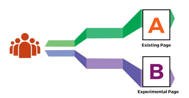
An A/B testing is a method by which you would compare two options for any given element to figure out which works better. Keep in mind, that it is best to test only one element at a time, so that you know that all change in user behaviour is a result of the difference between the two options.
How Does A/B Testing Work?
The way the tests work is half your visitors are shown one or the current version and the other half sees the second variation. You can also test serially, where all your users see one version for a given period of time, say a week and then they all see the other version after that period. This second manner has its own limitation of longer gestation period and effect of timing on the test. For example, a test run two weeks before Christmas might have different results from the one after Christmas because of the festive season.
In either case, the A/B testing tool of your choice will then spell out differences in user responses on a dashboard that compares the two options. Many A/B testing tools, like VWO and Optimizely are available. Given the same tests, you could even test which tool works better for you!
E-commerce A/B Testing Ideas
So, what can be tested? Just about anything. From design elements to substituting elements with each other to type and size of a font, to the number of words in a text and so on. Here are a few e-commerce A/B testing ideas to get you started.
While the headline of each of the ideas below contains only two options, of course, there will be more options you could test. You could get into iterative testing by having the winner of the first test compete with the option C (next option).
Design Element
Text vs. Icon: And of course, the third option “text+icon”. You can test these options for elements that have very well known icons, like sharing on social media or copy-paste or edit-save and so on.
Hyperlink text vs. Button: There are places where text might flow better with the content rather than an image. Try out hyperlink text on such occasions against the norm of a button after the sentence.
Box or Oval: Rounded edges look better, boxed corners are crisper. However, an irregular shape – say a stop sign or even a rectangle with arrows pointing out of its side edges might get more attention.
Black-blue vs. grey-green: Colors and color combinations are going to be one of the toughest design calls for your website. Try out different palettes in different iterations of A/B testing. Remember, the choices you make here have to go with the overall brand’s theme.
Comic Sans or Not: Common wisdom is totally against the comic sans font. However, maybe it works better for your special case. You won’t know until you try.
Medium or Large: Play around with size. Whether it is font or button or navigation bar or search box. This is all the more important if your target audience is differently able or are senior citizens.
Standard Icons vs. Home-Grown: Easily identifiable versus novelty – know what your users prefer by testing it out. This is especially true of social media buttons.
Position of Element:
Horizontal vs. Vertical: Should your navigation bar be along the length of your site or width? Should you present your menu options in a drop-down list or hyperlinks next to each other?
Left vs. Right Sidebar: Where should each element of your site go – on the left or the right? Or should there be only one bar? Or maybe it belongs to the bottom of the site. Pit one against the other and change that ‘maybe’ into a ‘we now know’.
Item Order in Menus: Which sub-category will bring more click-throughs in your category list? In a horizontal presentation, what is more convenient to users – ‘Contact Us’ first or ‘About Us’?
Single vs. Multiple Pages for Processes: A payment process is a ripe example of this one. Once the product is in the shopping cart, should the entire process be on one page with the steps running one after another or do your users abandon the cart less if each step is in a short page of its own. This is particularly important for mobile phones.
A pop-up box instead of another page is also worth a try.
A Timing of Pop-up Box: If you are looking for subscriptions using a pop-up box, try popping the box up at different times. Your A/B test could be to pop the box at 30 seconds and 60 seconds after the visitor has been on your site.
New/Current Feature/Offer: If there is a new feature or discount on offer you might want to try out different positions to bring attention to it. When done over time, one particular spot on the site might emerge as a clear winner.
Textual Content:
Almost each idea below applies to each item that has textual content. This includes your social media updates.
Casual vs. Formal Tone: Try out an approachable, friendly tone in your words versus a more firm, professional one.
Snippet vs. Long-Form: Most times people don’t have the time to read. But, there are some pieces of content that require the long-form. Check if providing a snippet from the article or an abstract of sorts keeps the visitors longer on the page.
Creative vs. Informative Headlines: There are times when you just want the headline to give the information and be out of the way. There are other times when a more catchy, quirky headline will rope the user in. Try both out with the same article/image and see which one works better.
Paragraph vs. Lists: There is really no telling if a paragraph will work better in a given context or a bullet list. For the same headline and content, try out both options and see which gets more shares or more time on the site and so on.
Negative vs. Positive Tone: There are times when you want to instil urgency to get a user to take a specific action. Maybe that’s the time when you want to point out that they might “Lose this opportunity” on something (negative). However, do you know that for sure. The same thing could have a positive spin – “Gain this now!”
“Save” vs. “Read me later”: As trivial as it may sound, websites have reported the significant difference in conversion between “Enter Promo Code” and “Got Promo Code” in the action box. Similarly, “Add to cart” works better in some cases versus “Buy Now”.
Non-textual content
Video vs. Images: Video is taking over. Or is it? Maybe the buffering time is not worth the wait for your users. There’s only one way to find out. Before you spend too much effort, time and money on professional images/video, try out simple photos and videos from your phone and then go with the winner for better quality.
Thumbnail vs. Full Size: This is more self-explanatory than the other ideas. Different times and places call for different size of images and videos.
People vs. Objects: Try out photos and videos of people using your product against those of just your product.
Image Carousel vs. Static Images: There was a time when image carousels were all a rage. Times are changing and static images are back in fashion. But, is that true for your site?
Younger vs. Older People: If you have decided on using photos of people, try out younger people versus older. Also, depending on the product, you could try media with kids. Other options to try are male versus female.
Animated vs. Live-Action: A grim subject like say insurance might need lightening up with animation. On the other hand, maybe it needs to be taken seriously and will work better with real people in action. While trying both might be expensive, it is worth doing a dry run with simple images or smaller length videos.
Auto-Play vs. Click-to-Play: While videos that auto-play might be annoying to you, your audience might find it as a convenience. Try and find out.
Product Description:
All the tests that apply to textual content ring true for product description. In addition:
Shipping Cost – Now vs. Later: There are pros and cons of mentioning the shipping cost up front. However, there might be a case where a shipping cost that the buyer might not mind once the decision to buy has been made might become a deterrent if known while making the decision.
Free vs. Money-Back: Do you offer your product for free or do you want to offer a guarantee? Which strategy affords more confidence to your buyers?
$5 vs. 5: The currency symbol is known to be intimidating. But, if your product is to come across as prestigious you might want to carry the $ sign. Again depends on your clientèle and their perception which cannot be determined without testing. Similarly, the prices without the decimal digits (5.00 vs. 5) are known to have different impacts on conversions.
Forms:
Mandatory vs. Voluntary: Try keeping the forms optional by allowing guest logins and see if your conversion is better than mandatory logins.
More vs. Less Information: While the norm is lesser the better. There might be times when your users are willing to offer more information because they feel reassured that it won’t be misused or it is worth giving it for what they are receiving.
Reassure Security Text vs. Badges: You could test a standard badge versus a line or two that reassure the user that their information will not be misused or they will not receive spam.
E-mail:
Your newsletters and e-mail can be subject to A/B testing too. From the length and words used in the subject line to whether the tone should be personal or impersonal. Similarly, sending out the same e-mail at different times of the day or different day of the week could have varying conversion rates. A monthly newsletter could receive different attention compared to a weekly one. Try out different from addresses too.
This non-exhaustive list can be applied to each type of page – landing, exit, product, category. Moreover, ads on Google or FB or other sites should also be tested for design and content.
Do not forget to compare test results between different operating systems, i.e. say between iPhone users and Android users.
As intuitive as it may sound, you absolutely have to document before and after of the tests. This is so you can compare the results to tests done thereafter. In fact, an ideal test would lead you to more tests. Which is also to say that A/B testing is not a one-off exercise. A good designer would continuously test different aspects of a site including the ones that were tested before. This is because people change and so do their tastes. You have to be up-to-date with the current trends and constant A/B testing is the only way to do it.